Good UCD
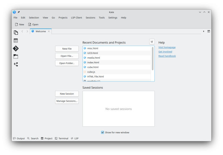
A prime example of not only good UCD, but a UCD improvement, is the recent update to my text editor, Kate. In the version of Kate released alongside KDE Plasma 5.27, a brand new “welcome” screen was introduced. Before this update, opening kate dropped the user into an empty text file, where they expected to start there work. Now, Kate opens on a user friendly screen, showing recently opened documents and projects and saved sessions. While to some it may seem only a small improvement, it makes the editor feel a lot more put together and it makes it a lot easier to immediately continue work after launching the editor.
Bad UCD
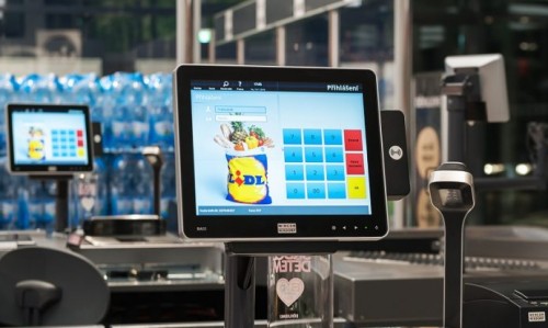
The Lidl register system, TouchPOS,made by GK retail is a prime example of terrible user experience, which I have the displeasure of encountering multiple times per week for hours on end. The register system is very touch centric, which makes it hard to tell if you are actually pressing the button you mean to press, often leading to large errors in terms of what is noted as a customers order.
Aside from this, the system is littered with inconvenient pop-ups, difficult to scroll through menus which often lead to unintentional selections of products, and incomplete indexes of products to manually select.
Empathy mapping
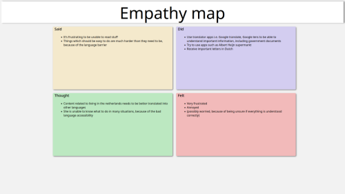
As practice for empathy mapping, we have been given an assignment to figure out what’s bothering classmates and illustrate this in an empathy map. I did this assignment together with Mariya, Who told me about her struggles as someone living in the netherlands, without speaking Dutch, a struggle a Dutch person such as myself will typically have a hard time understanding.
As a side note: This assignment is made using HTML and CSS instead of a more conventional method, as I was still warming up my skills after the break.
Affinity mapping
With the entire class together we have practiced affinity mapping, and the subject of this was the R10 building at Fontys Rachelsmolen, as of may 2023, We put all our pains and gains with the building and services at the back of the classroom, and it is a perpetual board to which we post anything we notice, ranging from very good, to very bad.
Observation in the wild
For observation in the wild, I'm likely going to add an entry in the upcoming vacation, and it will likely involve ways customers interact with things at my job, or how people interact with doors.
Card sorting
Card sorting is a method of discovering how navigable a site is, by categorizing different pages on simple sticky notes, to see if third parties would arrange our sites in the same way we did.
We practiced this in our project groups, and my group settled on applying card sorting to the Fontys site.
People often did not even come close the the actual structure of the fontys website, showing that there is a large discreptancy between what people expect to find and what they actually find.
IxD Comparison
An excercise as preparation, the IxD comparison assignment is to compare different webshops about the same topics, and see how different or similar they are, discover what design philosophies work better than others, and of course it's a great tool for finding ways to make your own designs more user friendly.
I compared three different furniture/living webstores, Wehkamp, Trendhopper and Bijenkorf, through which I discovered many ways in which these sites set themselves apart in usability and user friendliness, you can view this research in the document below:
Webshop prototype
As a webshop prototype, I have created an online bike store in figma, mainly based on the usability examples I discovered during the IxD Comparison
User research for project
User Testing for project
User testing plan
For my group project, I suggested to my team to do as much testing as we can fit into the remaining time. This is nog only because of things I'd learned in class, but in the meantime I had done some research into how some other companies do testing, especially Valve Software.
Valve Software makes user testing the top priority in developing anything, be it a game, device, or a program. Even at the end of the first week of developing something, It is their mission to attain user feedback on their work, even if they only have and idea or just the basic layout of a level.
My group and I decided that we would first create a user testing plan of our own, and then on big concise plan, by combining the individual ones. Below here is my user tesing plan. The original is written on paper, but this one is recreated digitally for readability
User testing process
I have been able to conduct user tests on two subjects.